
for expert insights on the most pressing topics financial professionals are facing today.
Learn MoreHow did companies like Amazon, Netflix, and Uber become leaders in their industries? They harness the power of analytics to create meaningful customer experiences and provide the necessary tools for their employees to create valuable experiences.
How do advisors and office managers do just that? With a tool that supplies them with the analytics valuable to their business.
Since the release of Advanced Analytics, we’ve been dedicated to redefining the experience you offer clients and the way you identify opportunities in your business.
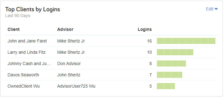
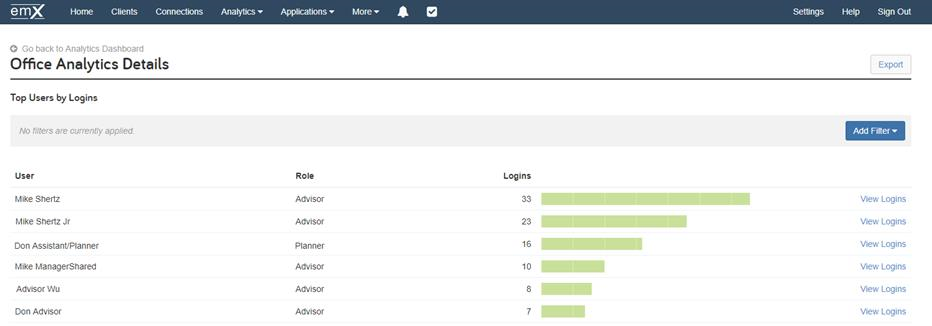
To provide you with the insights you need, we have released four new login frequency charts, Client Login Frequency, Top Clients by Login, User Logins Over Time and Top Users by Login, designed to help you understand website usage and engagement within your firm and client base.
 |
 |
For advisors using Advisor Analytics Pro, the new charts help you understand your clients’ login behavior shows you which clients are logging in the most and our analytics filters allow you to parse your data providing even deeper insights into client usage.
Client Login Frequency will show you when clients login the most so you know what day and time is the best time to engage your clients online. Top Clients by Login will show you which clients are using the client website the most. These clients are your power users and can be engaged to understand what they like most about the client website so you can share their best practices with clients that may have not adopted the client website as much.
Use Case: Are your baby boomer clients more engaged than your Millennial clients? Find out by filtering your Client Login Frequency chart by Age Group to identify power users in each demographic. Then hold conversations with those clients to find out what’s working and what’s not. Based on the data, you’ll be able to implement strategies to test what attracts each age group to their Client Site.
For managers using Office Analytics, the new charts let you quickly spot trends among your user base and yield better results faster.
Are your top performing advisors, and their support staff, more engaged with their technology than your low performers? By harnessing Top Users by Logins and User Logins Over Time, you can identify trends within your office.
Top Users by Login allows you to rank users based on login frequency, while User Logins Over Time assesses peaks and dips in user logins over a period of time. Equipped with this information, you can identify patterns between top users.
Use case: Spot trends between your top performers and most engaged advisors. By leveraging the “Top Users by Logins” and “Top Advisors” charts you’ll be able to identify if there is a positive correlation between login frequency and advisor performance. By determining patterns between your high and low performers, conduct data-driven conversations and put strategies in place that encourage better engagement with your technology.
To add the Login Frequency charts to your Analytics Dashboard, click the Add Charts button.
Combining these insights with existing analytics on the Advanced Analytics platform will allow Advanced Analytics users to continuously improve the customer experience to increase satisfaction, loyalty, and advocacy.
Not an Advanced Analytics subscriber? Learn more here.