for expert insights on the most pressing topics financial professionals are facing today.
Learn MoreYou’ve probably heard a million times how important it is to have a website or a blog. You hear it at the conferences you attend or read it on the blogs you visit (like this one!). It’s been reiterated so many times that it’s become white noise to you at this point.
Well, I’m happy to say I’m not going to lecture you about how crucial it is for an advisor to have a digital presence in the financial industry.
What I will delve into, however, is what a good digital presence actually looks like and how you can improve upon the digital foundation you’ve already built. Below, you’ll find three financial advisors’ websites that feature good design elements that prominently showcase the services they provide. Let’s get started.
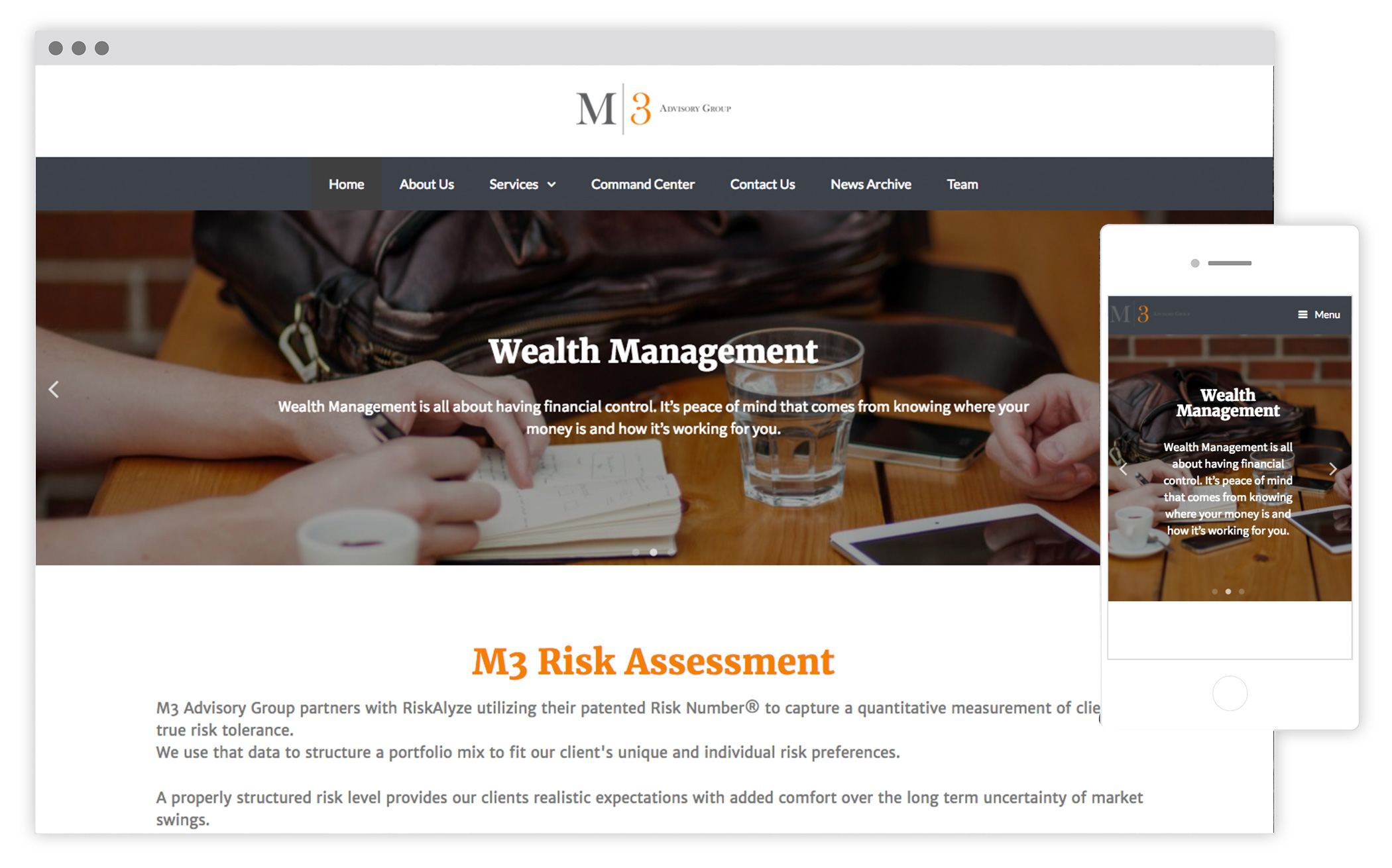
A frequently cited study says that most people will form an opinion about a website in about 0.05 seconds, and it seems like M3 certainly took that into consideration when they designed their site.
Visually stunning images appear as soon as the site loads. And with a quick scroll down the page, visitors can read M3’s mission statement, get a good idea of the services they provide and the software they use to execute those services.
Their website’s clean and simple look draws visitors and prospects in and encourages them to learn more about the firm and contact them for financial help, all without overwhelming them with excessive links or ambiguous navigation.
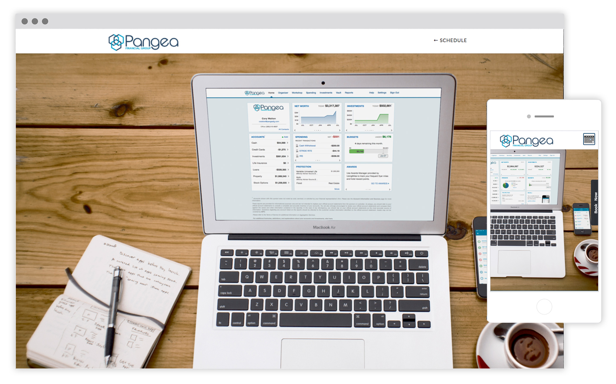
The Pangea team does a terrific job of presenting their services upon arrival of their website, which are the focus of their homepage. Their call-to-action links are prominent and visually prompt visitors to choose a navigational path.
Current client? Access your personal financial portal with a single click.
Potential prospect? Get an exclusive look at what your personal financial website would look like on a desktop or mobile phone. Or click in the top navigation to schedule an appointment.
Pangea’s website is effective because it gives its visitors clear instructions and links to resources to answer any questions clients or prospects may have.
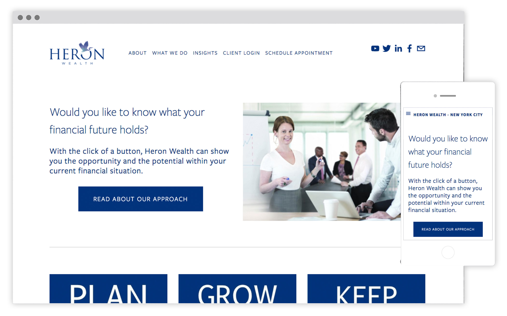
Heron Wealth also executes the clean look really well, but what makes them stand out is the slideshow of team photos front and center on the homepage that gives the website more of a personal touch. A quick look at the homepage also shows that they emphasize their social media channels and their blog, which are both updated on a semi-regular basis. These are great marketing tools for prospects to find Heron through, and for clients to stay connected to the firm.
And they’re also upfront with the services they provide – financial planning, investment advice, estate planning – and how they execute those services through the combination of different technology providers.
Having a well-designed website with clear call-to-actions will not only draw in traffic from prospects, but also has the potential to drastically grow your business. Think of your website like it’s a digital form of your office: you always want to make a great first impression.
A website that shows off your services in combination with good design, appropriate content, and easy navigation will do wonders for your firm’s credibility and will instantly set you apart from your competition.
For more tips on how to improve website structure, planning content, and more, check out this Advisor Website Booklet.